Magento 2
theme
development
theme
development
Client:
Cornerstone Home Design
Cornerstone Home Design
Date:
07.2020
07.2020
Services:
- UI/UX Design
- Frontend Development
- Backend Development
- Consulting
Intro
Magento for Home & Design store
Cornerstone Home Design is a company with its headquarters in the south part of San Francisco, which has been operating on the US market for over 20 years.
It is a direct importer of natural stone, offering a wide range of products: from kitchen worktops to plumbing fixtures. The company, which has only provided services in physical shops until recently, specialises in design and sales of kitchen furniture, worktops, plumbing fixtures and floors.
Cornerstone Home Design focused exclusively on physical shop sales through its showrooms. The company decided to expand its activity at the beginning of 2020 by launching an offer of its products on the Internet.
Why we choose Magento?
Magento is one of the most popular e-commerce platforms in the world, which handles annual transactions worth over USD 100 billion.
It is an open source system, managed by an army of developers, mastering and extending its features daily. Therefore, it became the most versatile system on the market, flexible enough to easily meet the expectation of the most demanding clients.
The project was based on Magento 2 Community, and our task was to design and create a shop template. We also used the Amazon AWS infrastructure, and our works included installation, configuration and New Cornerstone CaseStudy 4 optimisation of shop activities as well as providing training and consulting services.
Create well-optimized
e-commerce store.
e-commerce store.
Show
a vision
a vision
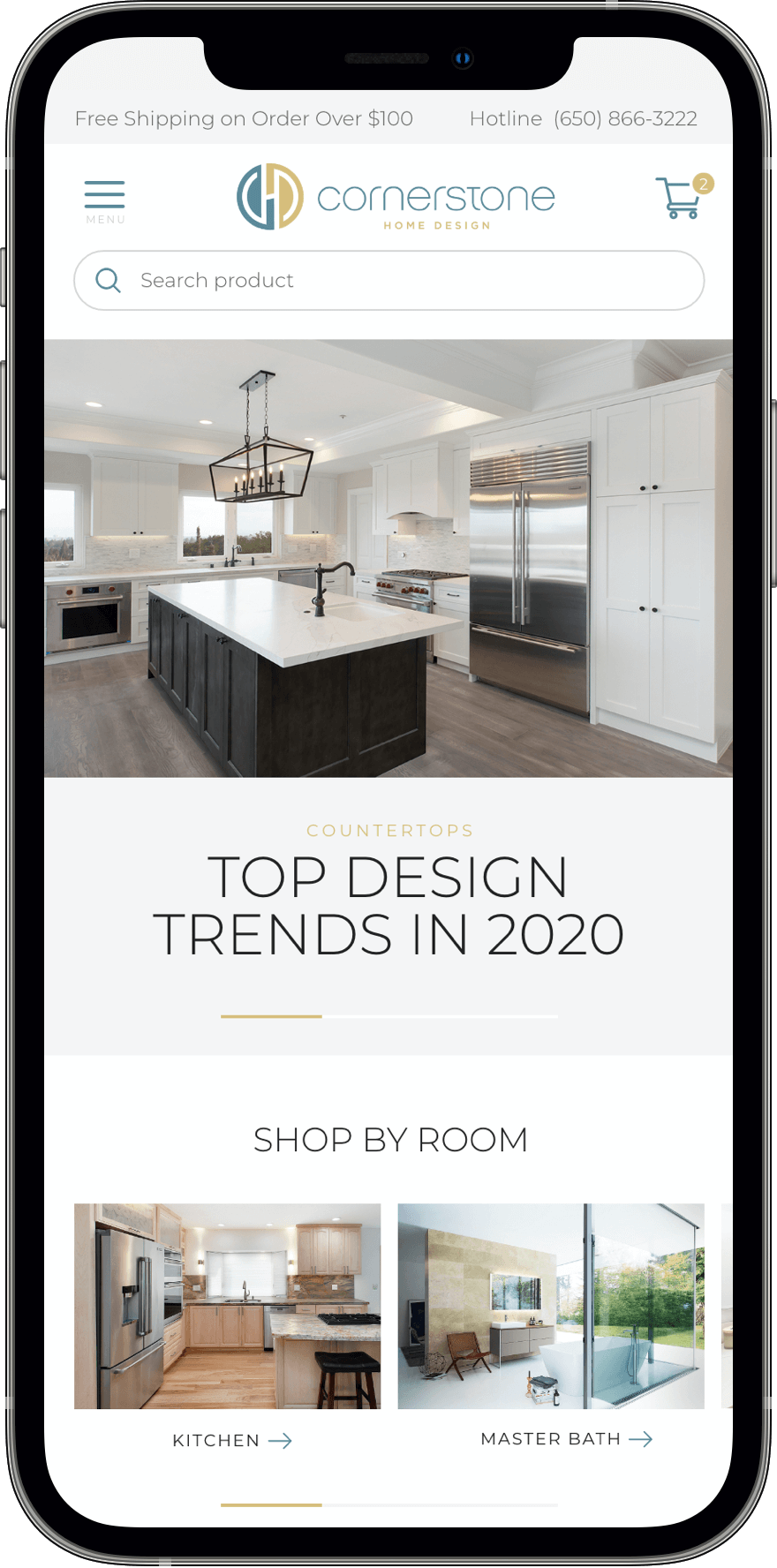
The e-commerce shop had to reflect the way in which the company operates, namely the assumption of selling a vision of using the products, instead of only selling the products. Therefore, in addition to a standard slider, the home page featured an inspiration section showing various rooms where the products were used.
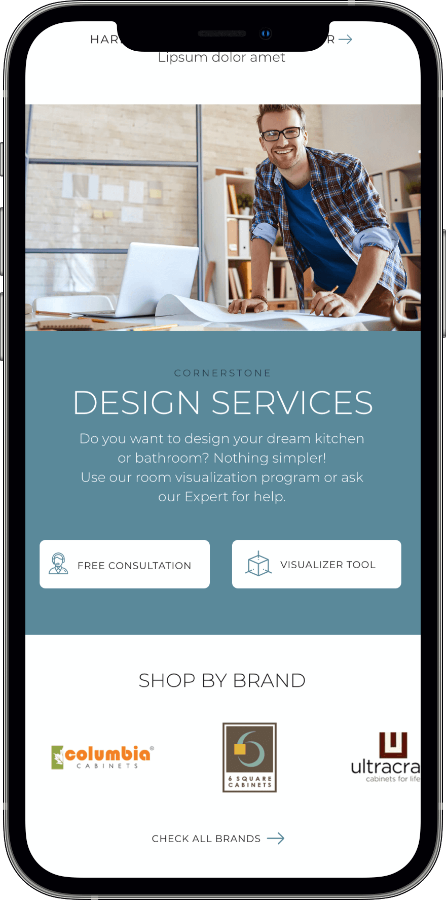
The website also includes a tool that enables users to design a specific room.

Easy
filtering
filtering
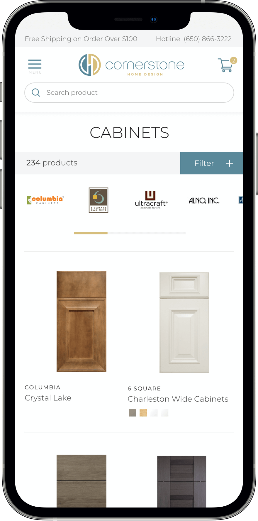
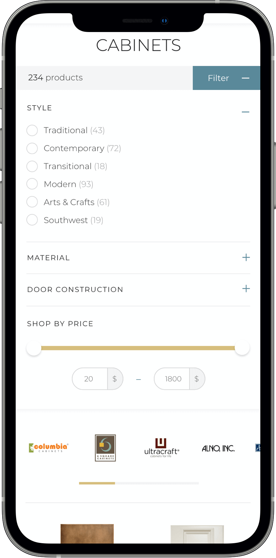
The product range includes worktops, furniture, floor tiles and many other items that come in a large variety of colours, materials or textures. It was important to develop a clear filter design, which would make browsing of all the available product options more convenient.
The manufacturer’s brands at the top of the category page is another option enabling product filtering by manufacturer.
Key
features
features
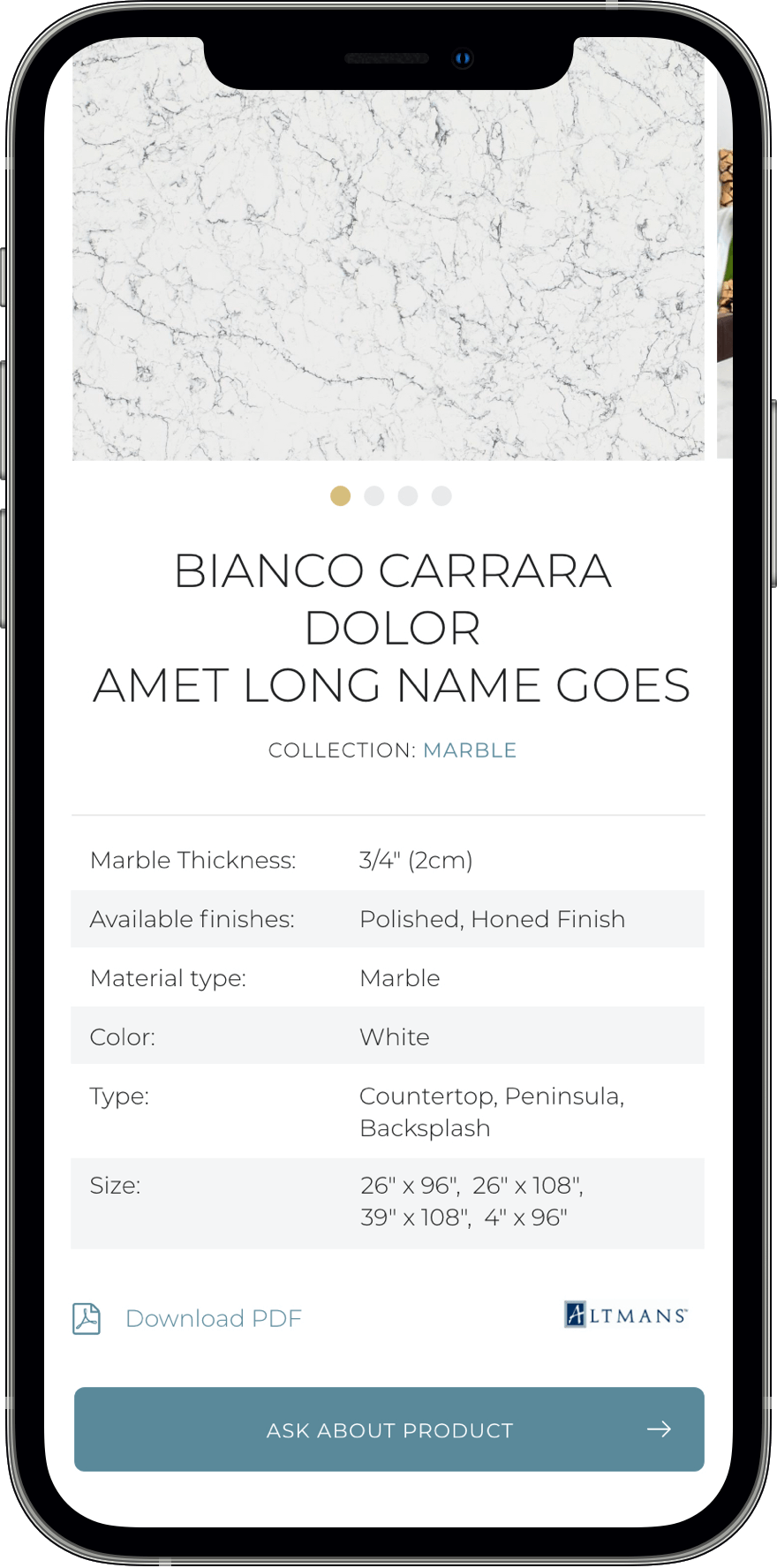
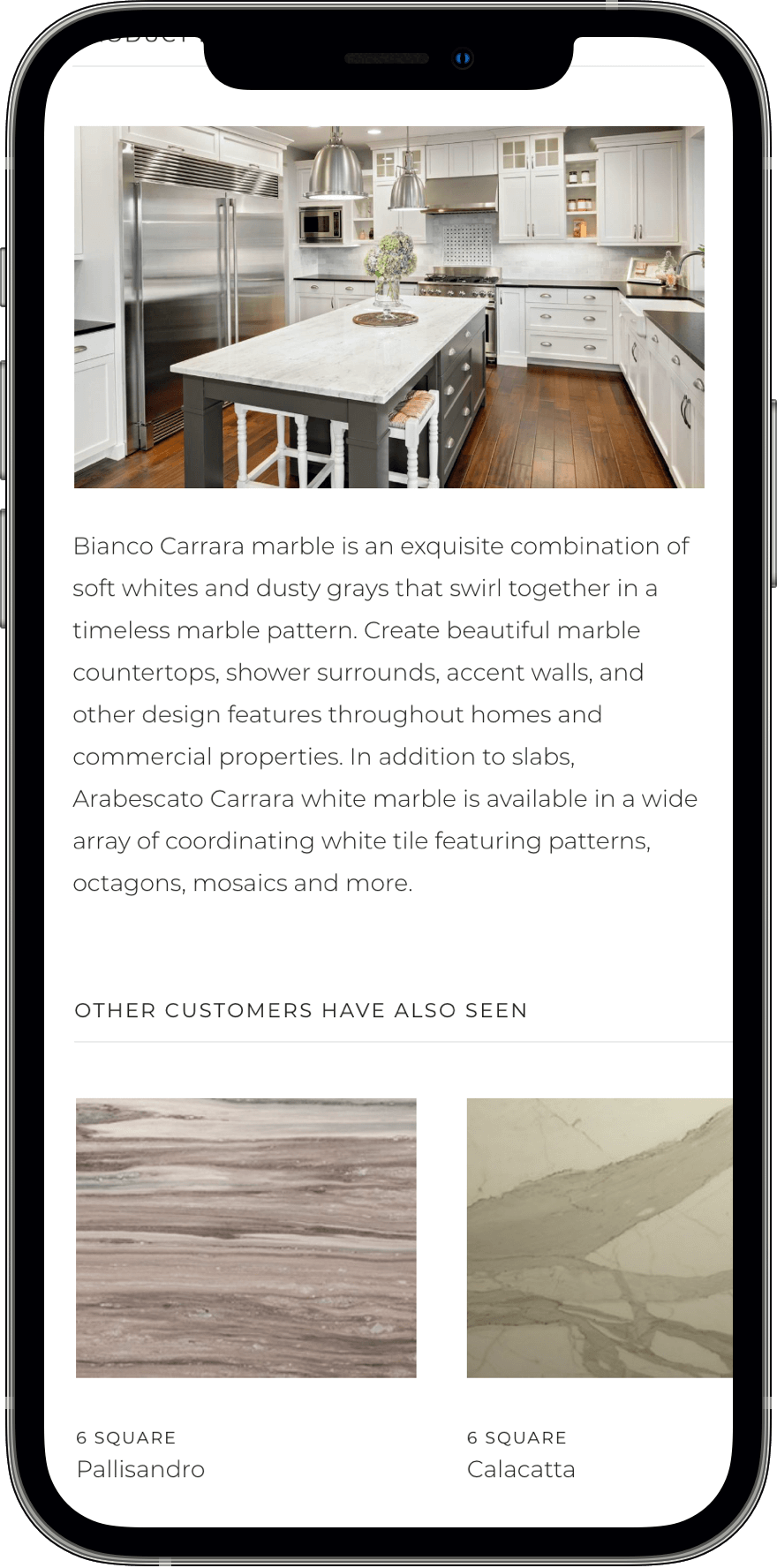
Due to the highly varied offer, we had to create a product page, whose design would clearly present a lot of technical data (key product properties). It was specifically essential to choose features worth exhibiting on mobile devices.
Focus on
shopping experience
shopping experience
+35%
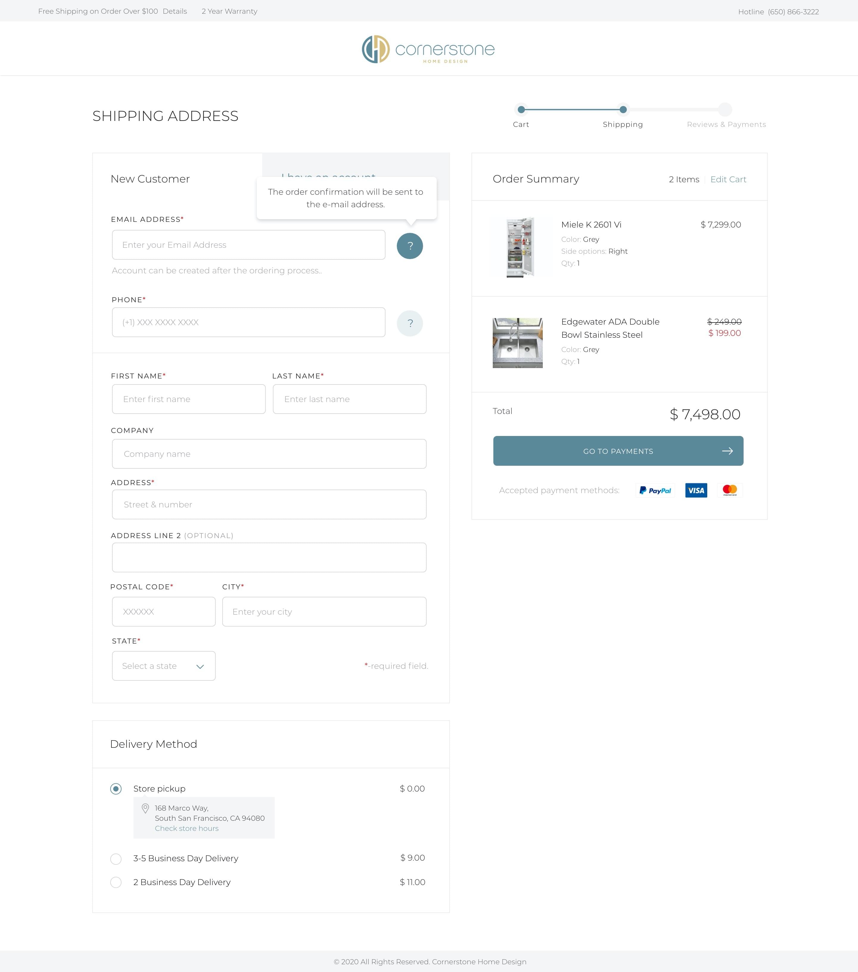
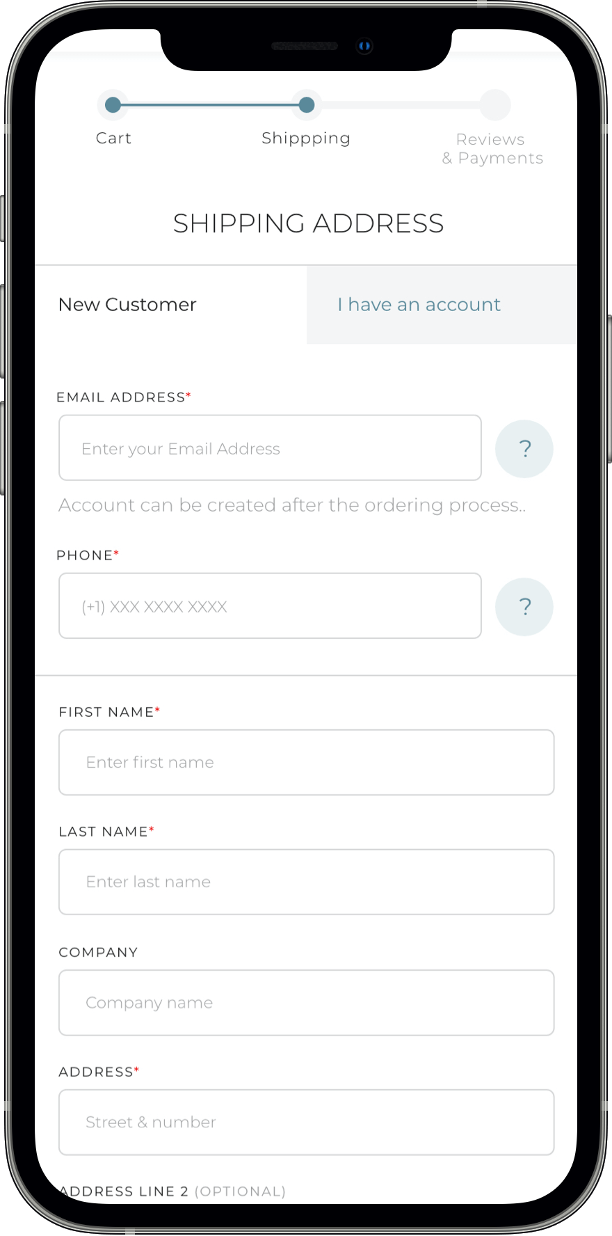
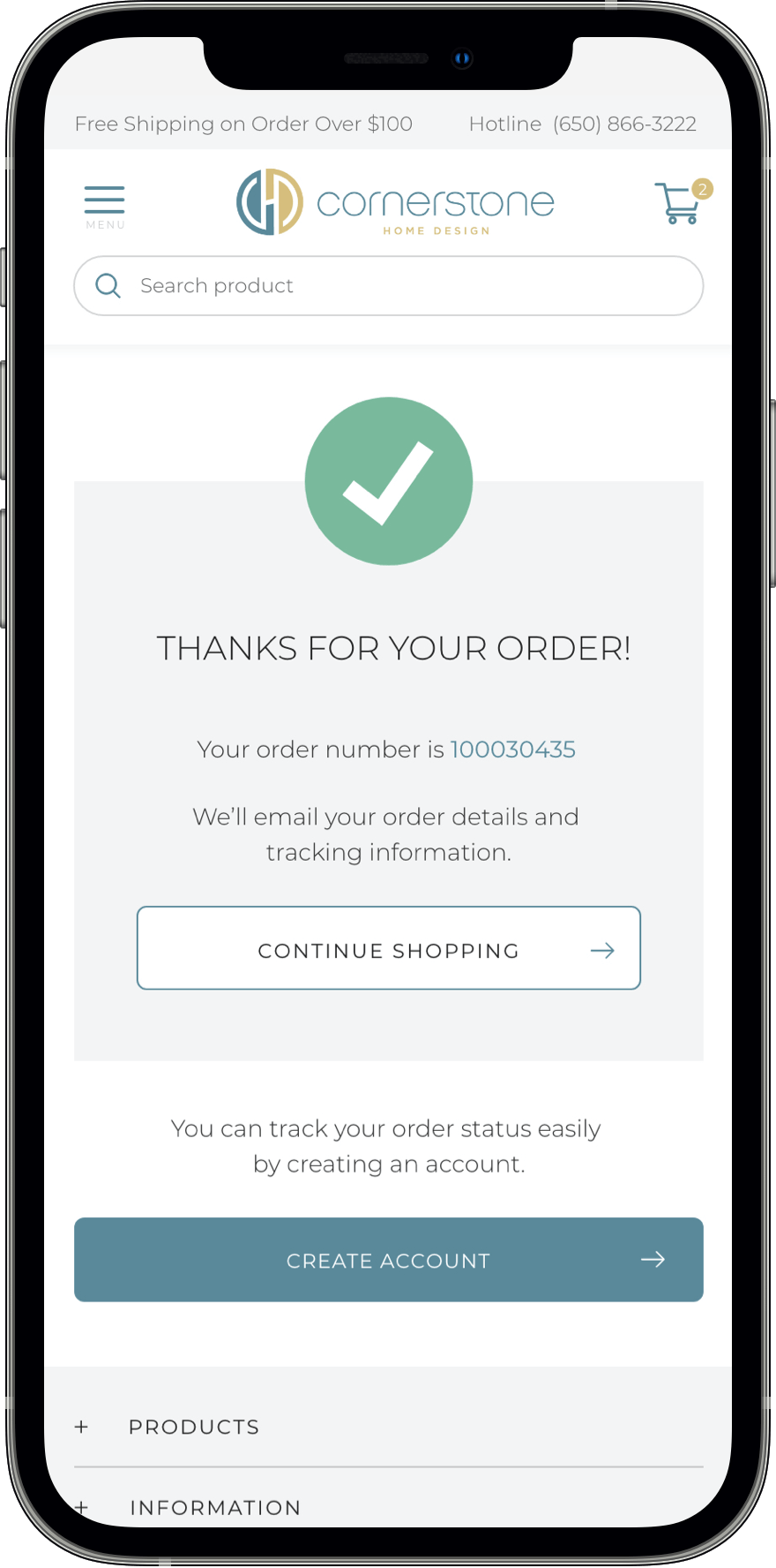
According to the Baymard study, proper checkout optimisation can increase the conversion rate by over 35%, which indicates that this sub-page is one of the key elements deciding on purchase.
Proper design will help the users place their orders easily and comfortably also on mobile devices.
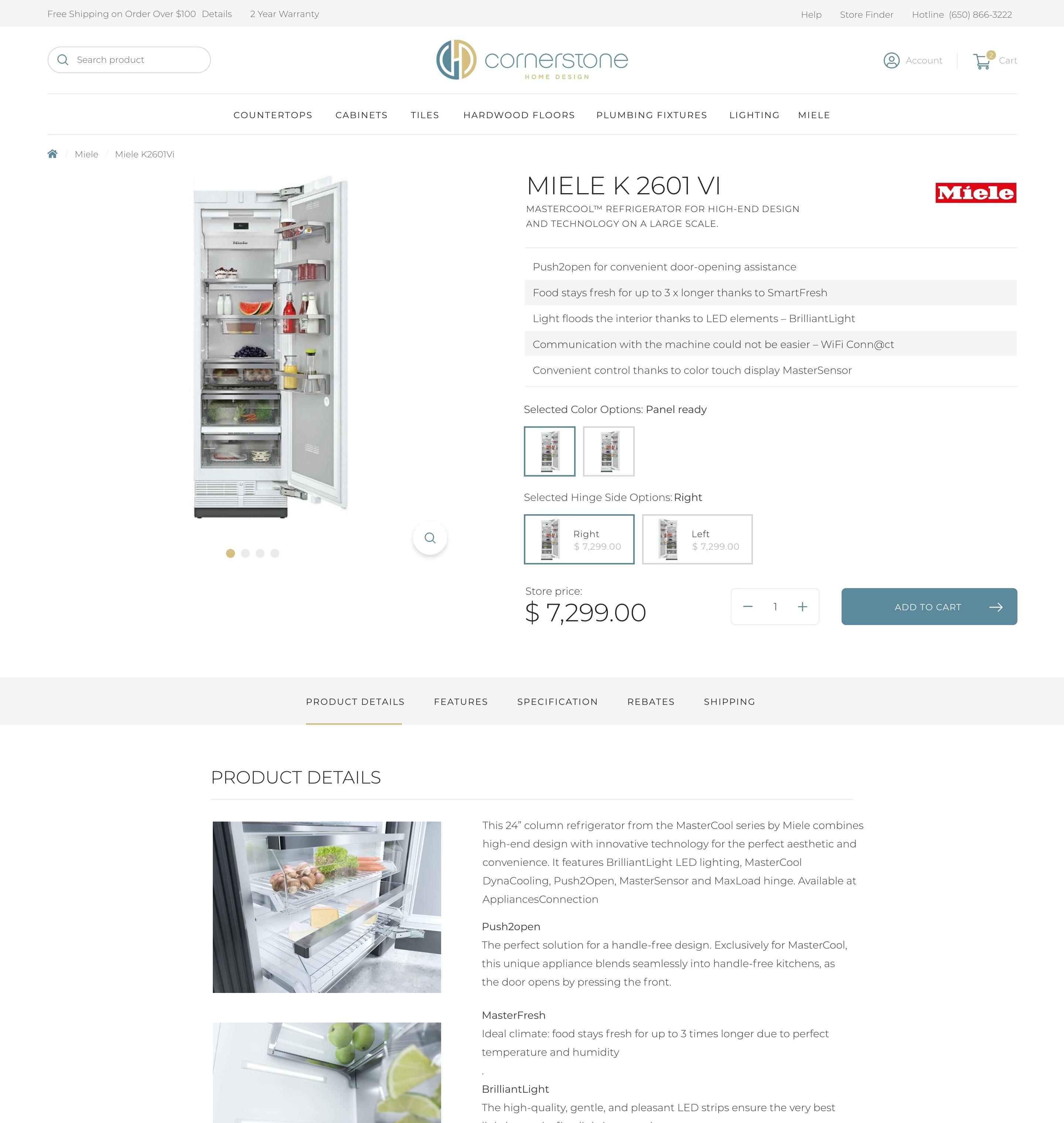
Not only the most important features and the manufacturer’s logo were placed at the top of the product page, but also convenient graphic swatches, which boost and simplify the choice of a given option.
Send us a
message.
message.
pixes
ul. Kombatantów 34,
66-400 Gorzów Wlkp. Poland
hello@pixes.co
+48 509 797 274
Scroll